Creating Your Website: Nick Bare Case Study

TL;DR
Looking at your website, a potential customer should be able to determine exactly what you offer, how your offering can make his or her life better, and how to obtain your offering
You must address your target customers’ problem while establishing your authority as an expert in your niche
Outline the three steps potential customers must take in order to do business with you
While Playbook provides you with a sales landing page to market your business, you have to go above and beyond and create a website for your subscription business if you really want your app to succeed. Your website guides potential customers through who you are and what you do. We’ve walked you through how to create a website using Squarespace, but before we jump further into the content that’s essential for your website, it’s important to remember that people do not read websites — they scan them. That means you need to cut to the chase. Use images and video to illustrate your app and its services, and keep reinforcing your offering throughout your entire website.
You should include:
At least three “Start 7-day free trial” CTA buttons to your sales page URL.
At least the following eight sections, which we’ll walk through in detail below with Playbook creator Nick Bare’s website.
Note: If you’d prefer a more basic website, just stick with the three essential sections for your website we outlined here.
Section 1: Website Header
One of the key parts of building your brand messaging around your customer is the simplicity of your messaging.
Anyone who visits your website should be able to quickly determine:
What you offer
How your offering can make his or her life better
How to obtain your offering
All of these answers should be in your website’s header, as it’s more likely a potential customer will continue scanning the rest of your website if they understand these three things from the start.
Here’s a great example from Bare:
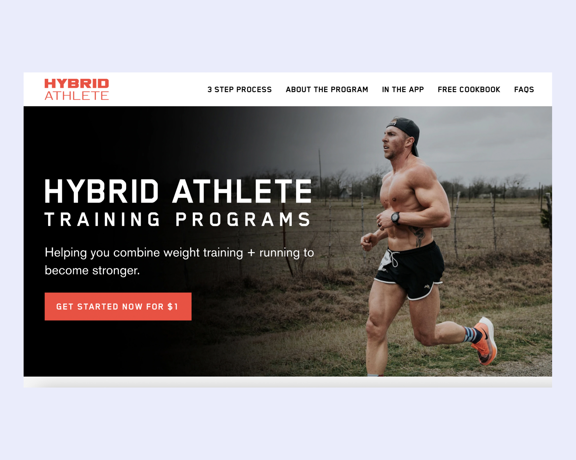
Anyone visiting Bare’s website can easily answer those three questions:
Bare offers hybrid athlete training programs
His programs help users combine weight training and running to become stronger
Users can obtain that offering by clicking “Get Started Now for FREE”
Note: That’s one CTA to download Bare’s app!
Section 2: Address Your Target Customers’ Problem
Your website copy must identify the problem you solve for your customers.
This section of your website should address:
The problem your customer is facing
How that problem is making them feel
How that problem can be solved through your app
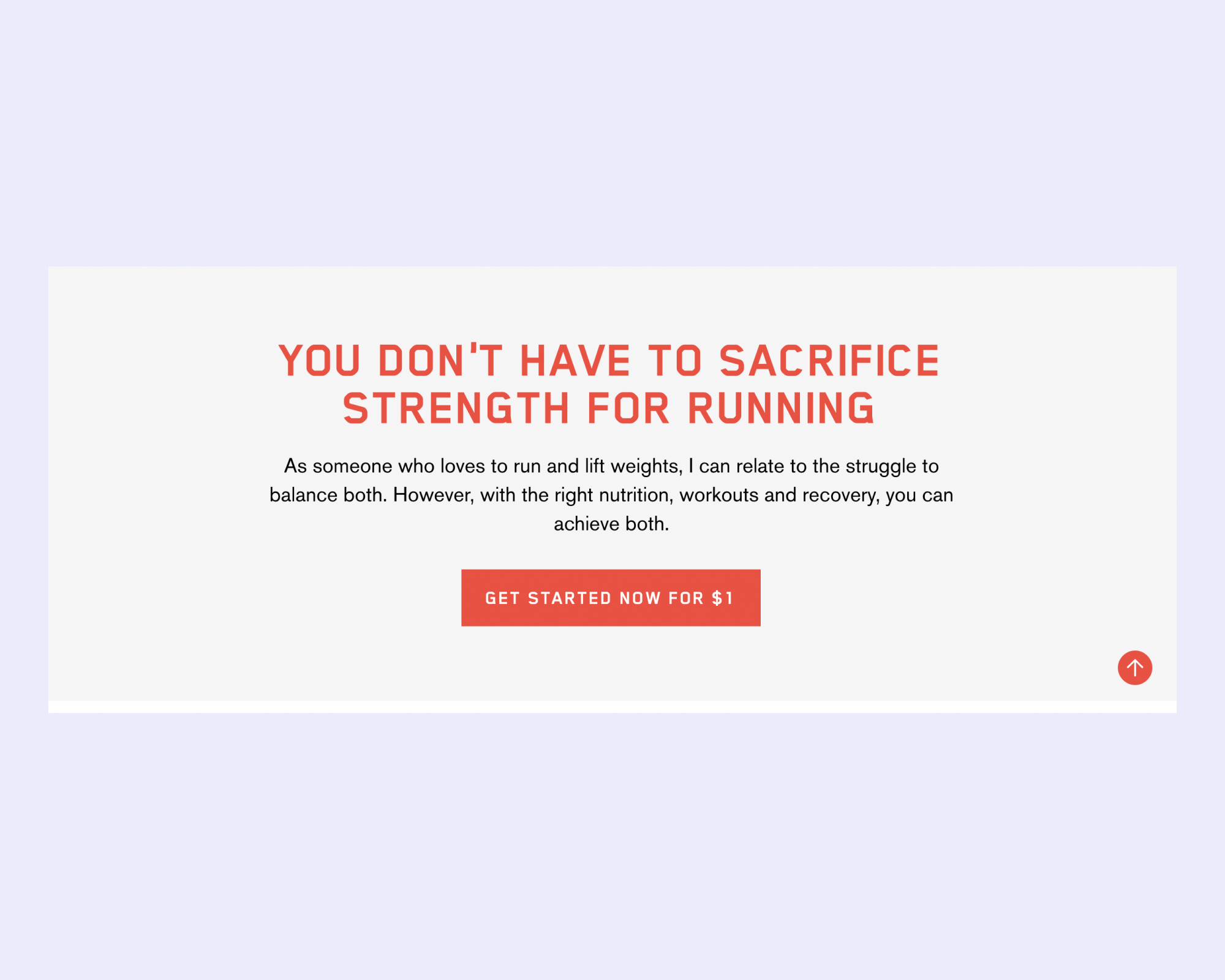
As you can see, this section addresses:
Bare’s target audience of athletes who wish to balance running with strength training
They feel they can only do one or the other in order to succeed
Bare reiterates that his app can help users achieve both through nutrition, workouts, and recovery
Note: That’s another CTA to download Bare’s app!
Section 3: Value Proposition
Your value proposition is what customers will gain from your app. What physical and mental benefits will they reap by signing up?
Here’s an example of a value proposition:
“My fitness app is designed to streamline your workouts in just 30 minutes a day. I offer both home and gym programs that will help you burn fat, define your midsection, and get stronger every single day!”
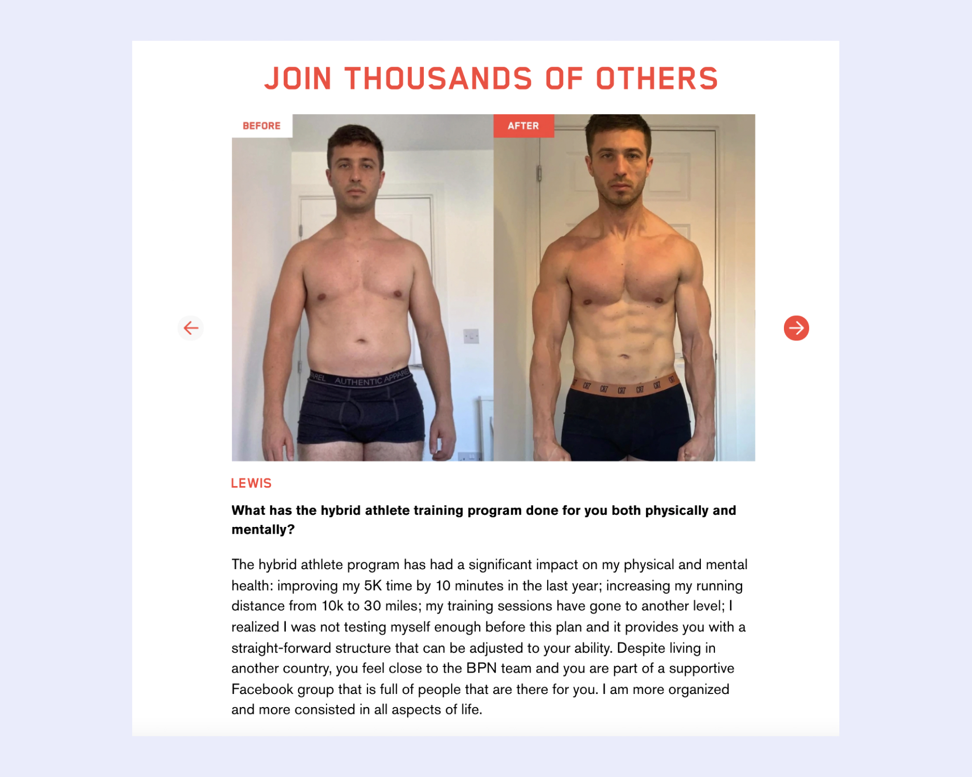
Your value proposition can also be demonstrated through social proof, like testimonials.
Section 4: Establish Authority
Why should potential customers trust you? What experience and expertise do you have that can help them reach their goals? Now is the time to assure your customer that you can help them solve their problem.
This explanatory section should also include a brief summary of your background, including any credentials and accomplishments. You can achieve this through written copy or a video.
Example:
“A former D1 athlete, I am a CPT with a specialization in nutrition. I’m also a certified wellness coach. I’m obsessed with personal growth and love helping women challenge themselves to push past their comfort zones in order to grow mentally and physically.
Let me help you reach your fitness and wellness goals!
Start today for FREE”
Here’s a great example from Bare’s using video to communicate his authority on hybrid training, while empathizing with the struggles his target customers face:
While creating a video does take some extra effort on your part, it’s absolutely essential to include video content on your website, as doing so can potentially increase conversions by more than 80%.
Here are three tips for making a video that converts sales:
Keep it brief. The optimal length of a website video is between 30 and 60 seconds.
Create a compelling header. Give people a reason to click on your video with a great title!
Show, don’t tell. Bare’s video includes himself speaking to the camera, but also illustrates his app, his experience, and includes footage of him doing his hybrid athlete program.
Section 5: Describe Your App
The purpose of your website is to make app sales, so make sure you describe the app thoroughly!
This section should detail your offering, how you solve your target customer’ problem, and how potential customers can succeed using your app.
Share what users can expect to gain from using your app and any training requirements and include a CTA button to download your app.
Example:
“My app was created to help women develop a greater balance through their fitness and nutrition journey. My workouts are quick, yet effective, and will push you to your limits. My app is for all levels! Whether you are just starting or have been working out for years, my workouts are for you. My goal is to help you become a better version of yourself, to help you achieve a healthy lifestyle, and to help you reach your goals. I offer both at home and gym workouts in my app. If you are doing the home workouts, you will need dumbbells and a yoga mat. My gym workouts require standard gym equipment. I can’t wait to start training together!
Start today for FREE”
Here’s how Bare does this on his website:
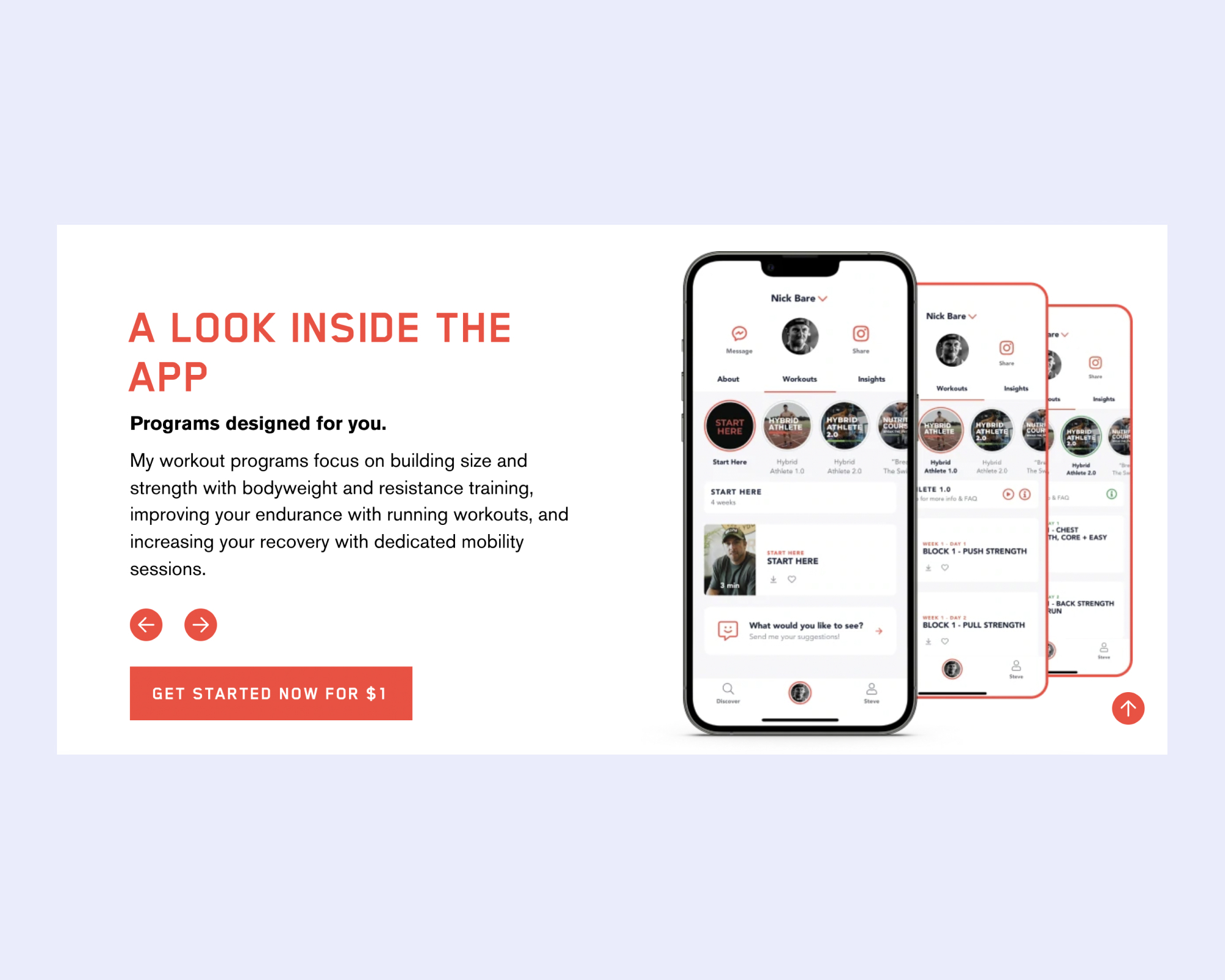
Note: If you’re keeping track, that’s the third CTA to download Bare’s app!
Here's another great example of this from creator Elliot Burton:
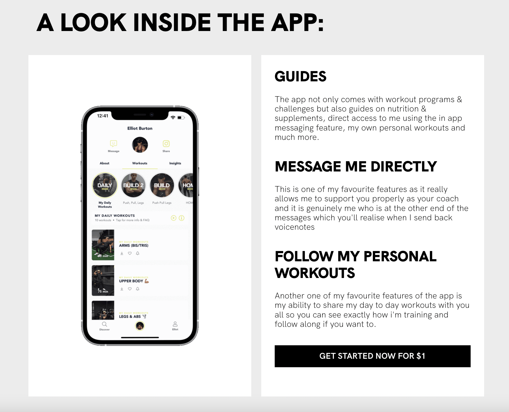
Check out Burton's website here.
Section 6: Create a 3 Step Process to Success
Remember that people tend to scan websites rather than read them thoroughly, so you want to bullet out the top three steps your customer can take in order to train with you. Each step should be incredibly succinct and should end with a call-to-action to download your app.
Check out how Bare does this on his website:
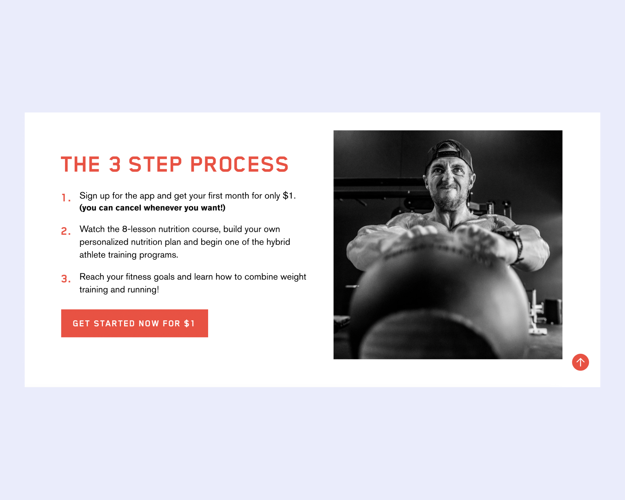
Note: This is the fourth and final CTA to download Bare’s app!
Section 7: Include a Lead Generator
Keep in mind that not everyone who visits your website will be ready to make a purchase right away. Remember, on average, it takes anywhere between eight and 10 touches to make a sale.
By creating a lead generator, like an email marketing signup or free e-book download, you provide potential customers with something valuable in exchange for their email address, which you can use to remarket to them in the future.
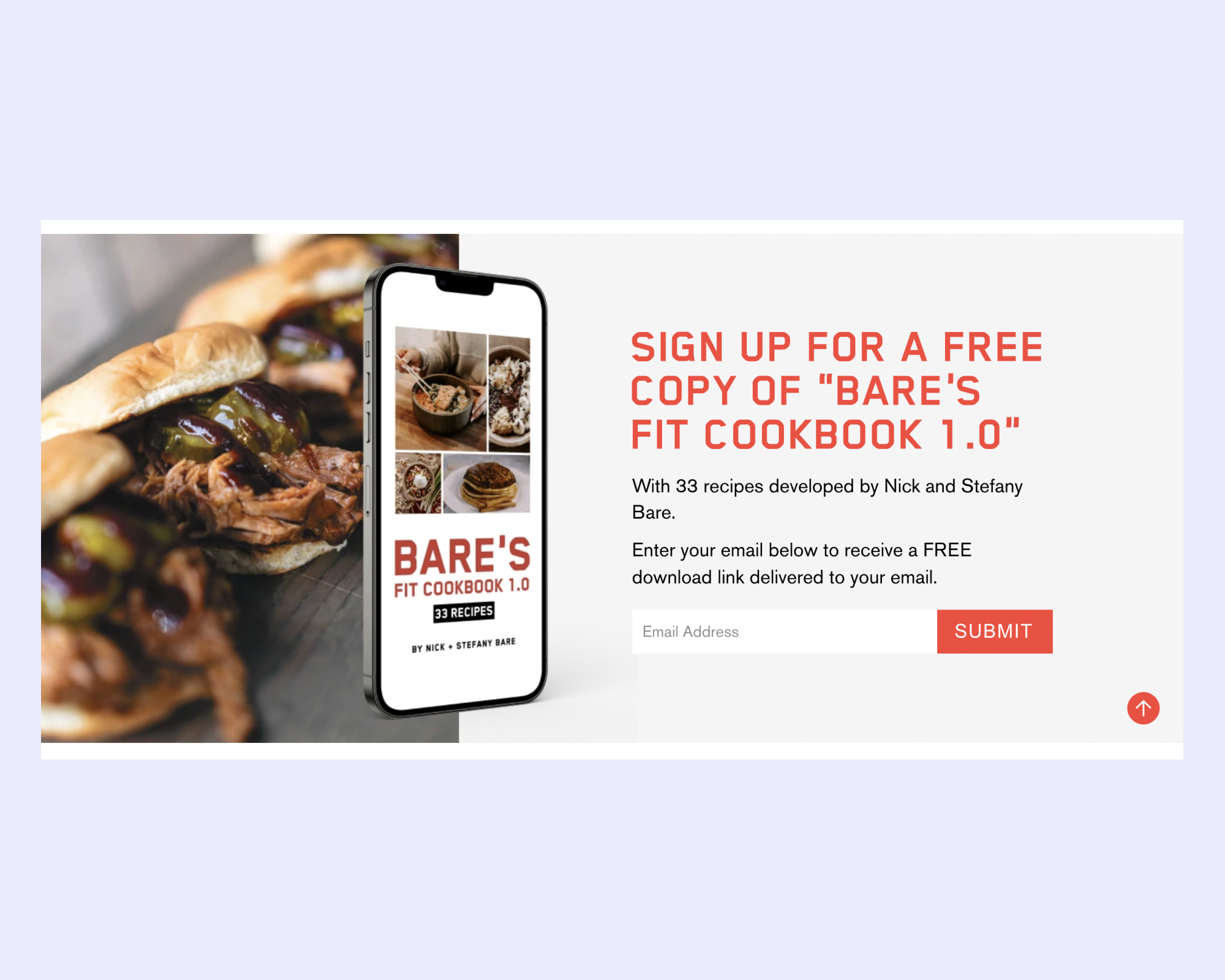
For more on lead generation and Bare’s example, read our article on how to sell here.
Section 8: FAQs & Contact Information
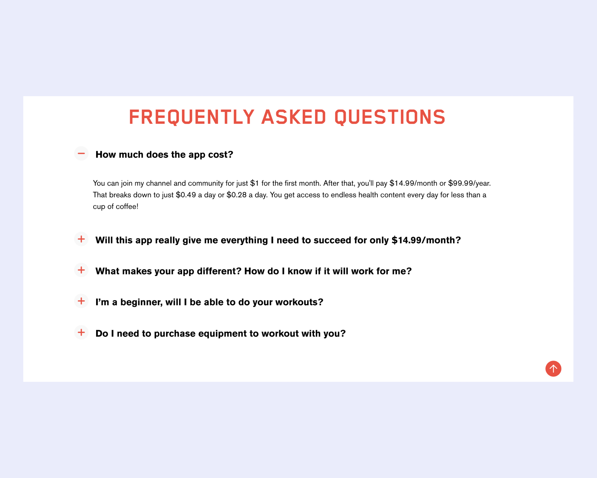
While you have provided all necessary information about yourself and your app at this point, we recommend including a section of scannable frequently asked questions at the bottom of your website. This will help prevent additional questions flooding your inbox!
Here are a few example FAQs to include on your website:
How much does the app cost?
Will this app really give me everything I need to succeed for only $14.99/month?
What makes your app different? How do I know if it will work for me?
I’m a beginner, will I be able to do your workouts?
Do I need to purchase equipment to work out with you?
Do I need a gym membership?
Lastly, make sure to share how potential customers can contact you via email or social media with any lingering questions they may have.
Example:
“Start today for FREE
If you have any questions or concerns, email me at youremailhere@email.com.
Follow me on Instagram and Facebook!”